Introduction
As per the design challenge, I was tasked with designing the signup experience, with a step to purchase, for a SaaS product that helps consumers.
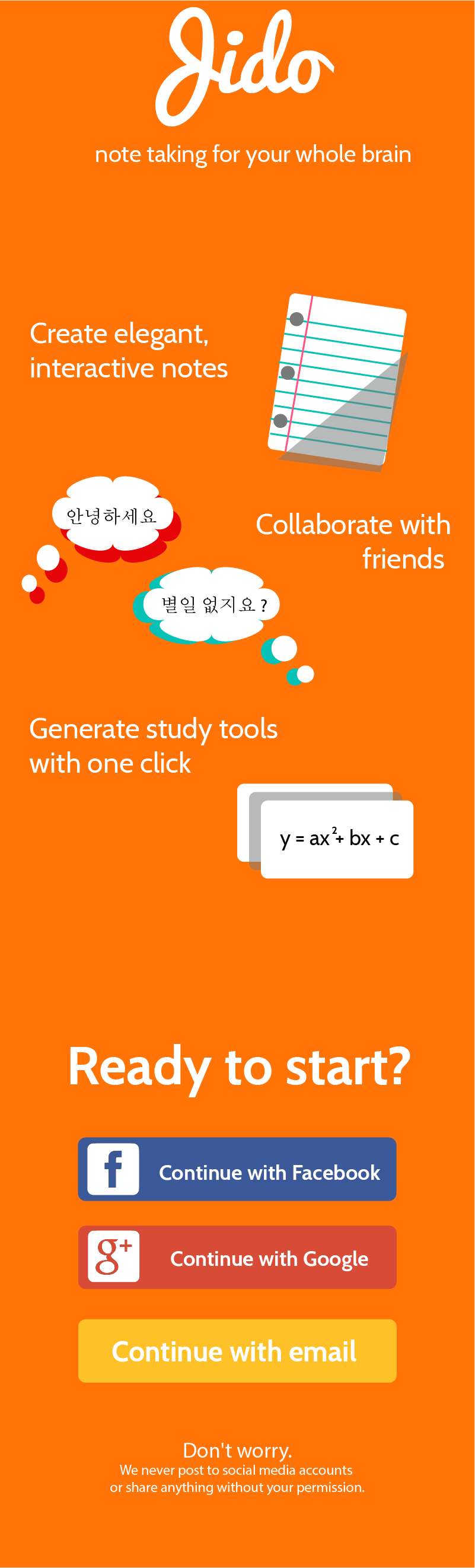
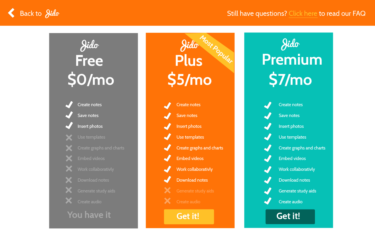
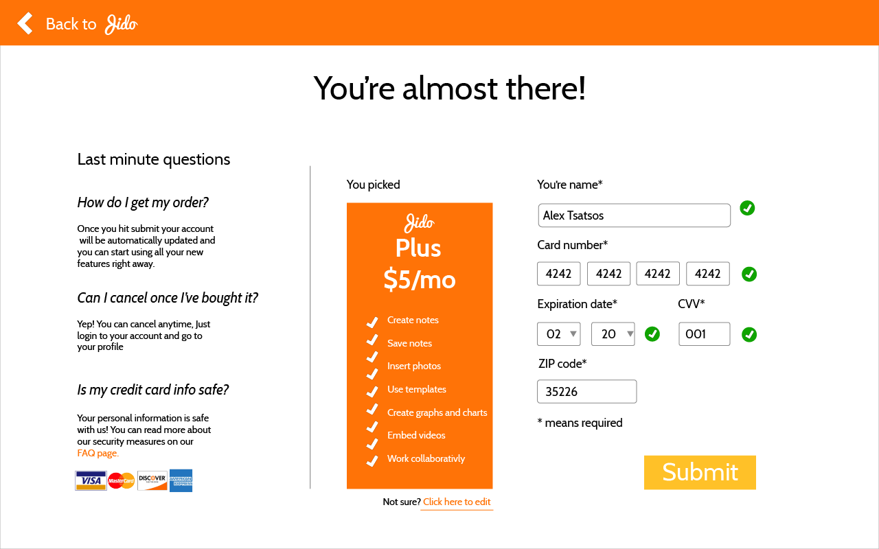
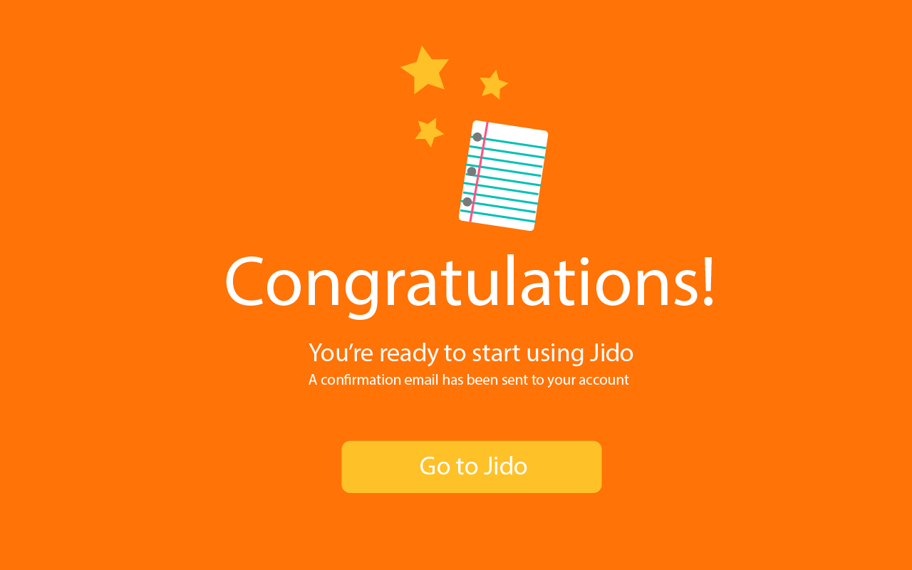
To illustrate this, I imagined a product called Jido, that helps users create interactive, visual notes that sync across all of their devices. With Jido, users can choose between three versions: free, plus, and premium.
For the purposes of this challenge, my design at a minimum needed:
-a signup page
-a page to view different purchase options
-a checkout page to complete the purchase
Research and Users
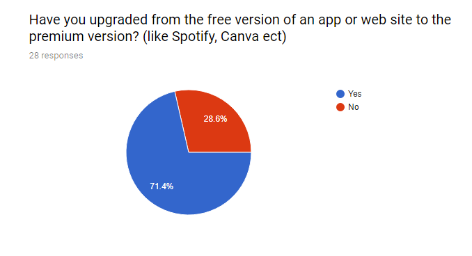
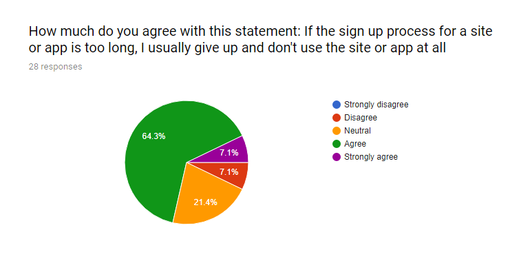
I conducted research with real people via social media to figure out what they liked and didn’t like about online signup and checkout processes. I created a poll and gathered over 30 responses which gave me a lot of insight into how the average user navigates the web and mobile sphere.
User Flows
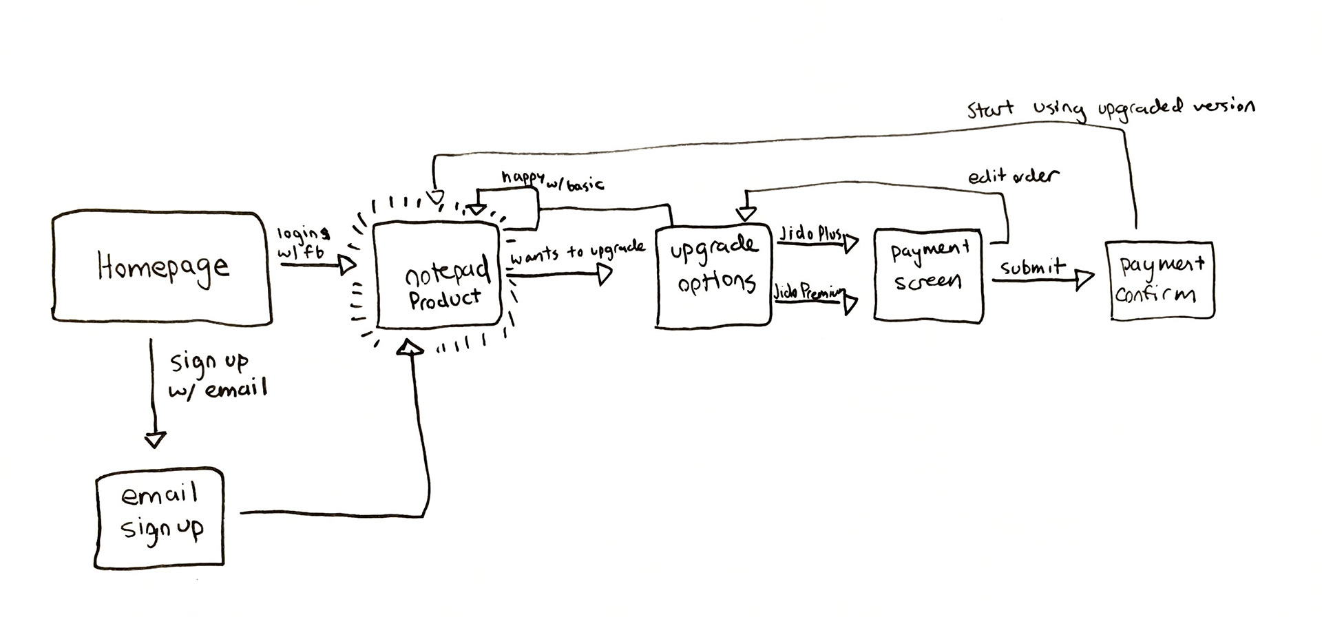
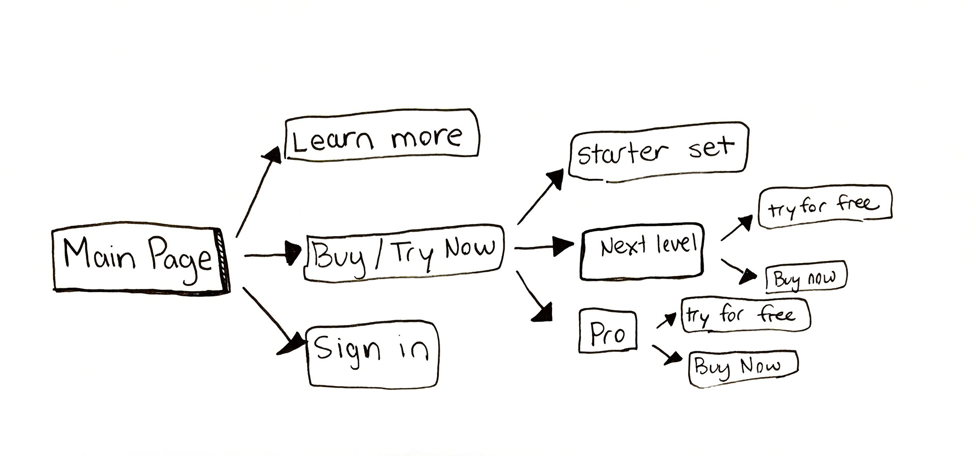
To start my process I created a couple different user flows to get a big picture idea of how the user would move through the sign up and purchase process. I initially created the first two different user flows.
I ultimately decided against both of these because
- There are too many screens between the user and the product
- It asks the user to make too many choices about buying the product before even getting a chance to use or see it
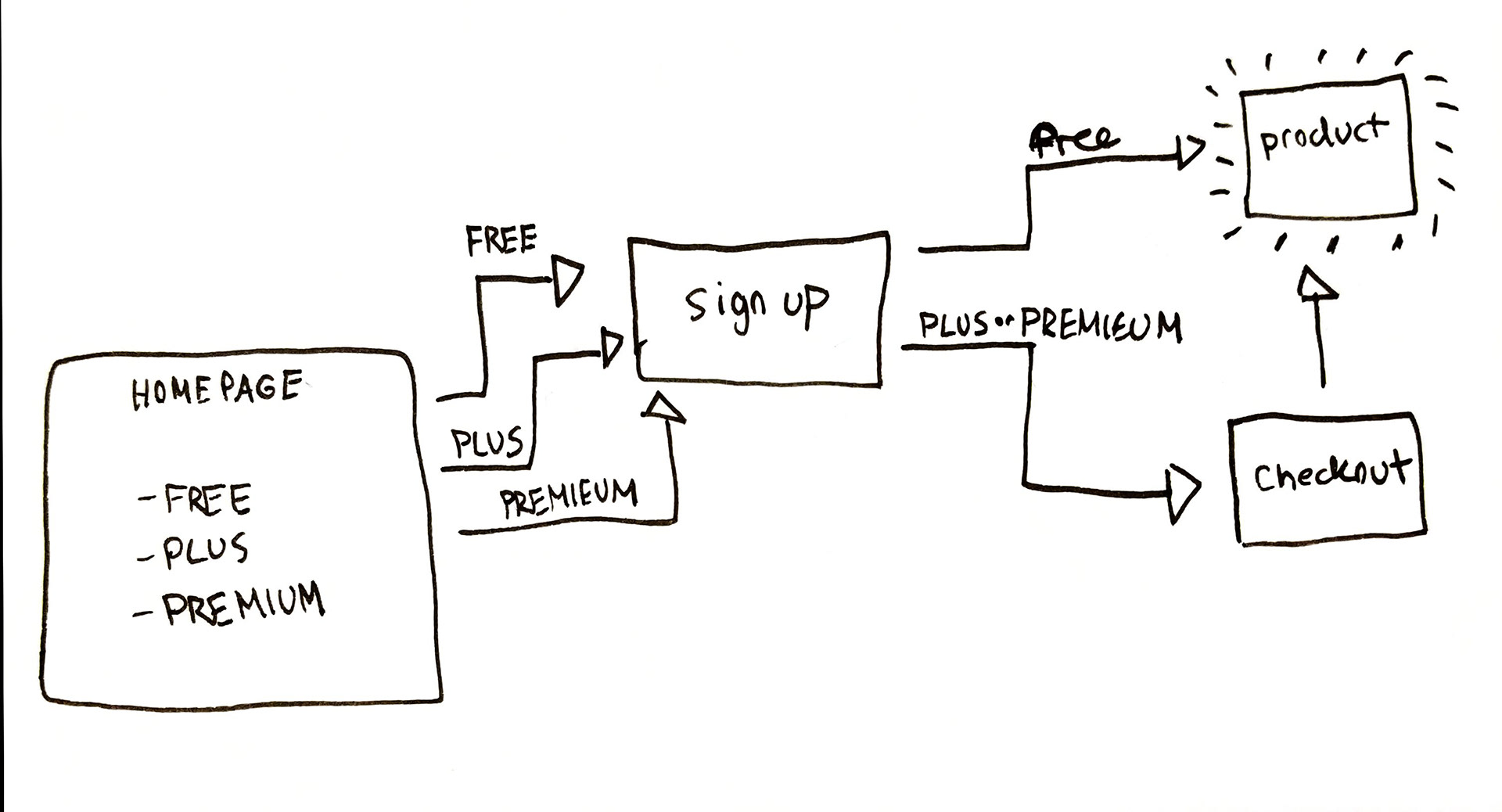
I ultimately decided on the third user flow because it allowed the user to use the product before asking them to buy anything, it minimized the number of choices a user had to make up front and it put only one screen between the user and the product.
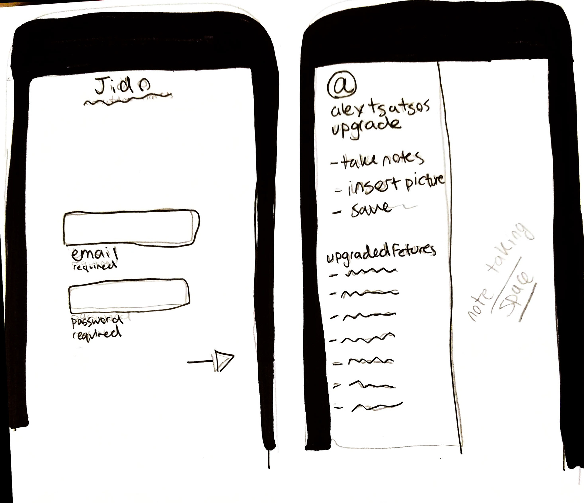
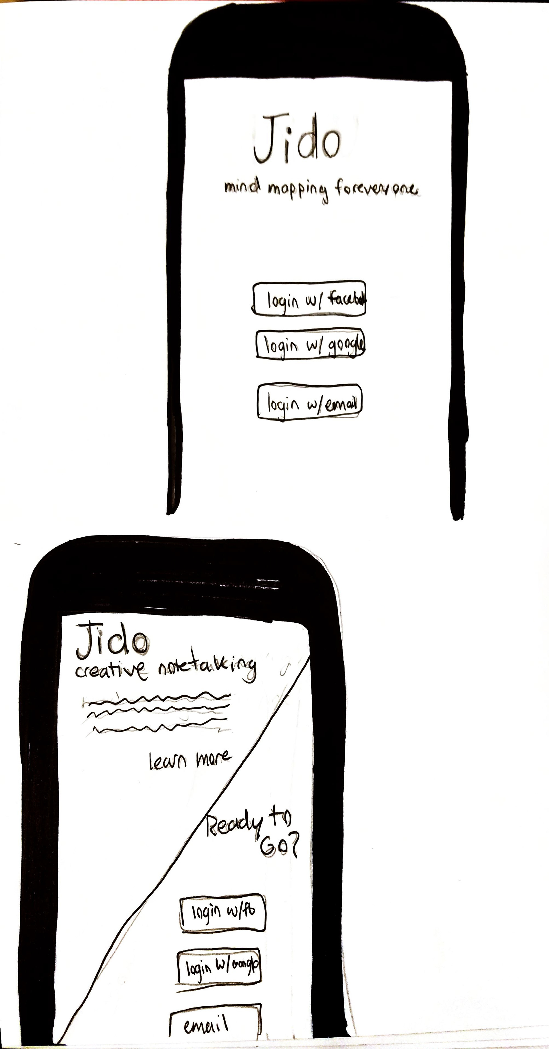
Wire Frames
After looking at the user flow, I established that I needed to design 6 pages: a homepage, an email signup page, a product, upgrade options, a checkout page, and a purchase confirmation. Here are some of my wireframe sketches
Clickable Prototype
My next step was to create a clickable prototype to flesh out the interface and put the user flow to the test. I used Axure RP 8 to create this. You can click through the prototype here.
I also sought user feedback on my prototype. Most users liked the flow of it of it but I did take a lot of suggestions on layout especially the placement of frequently used buttons.
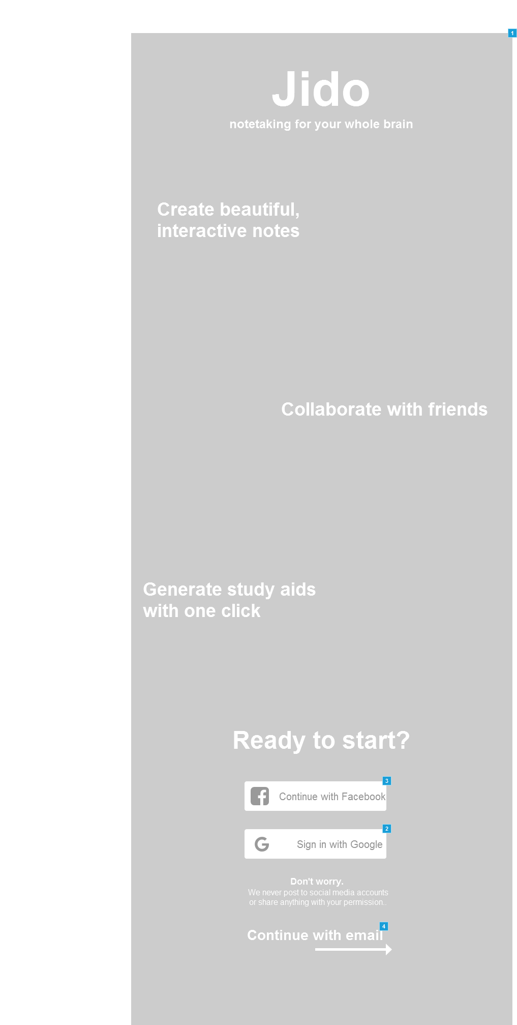
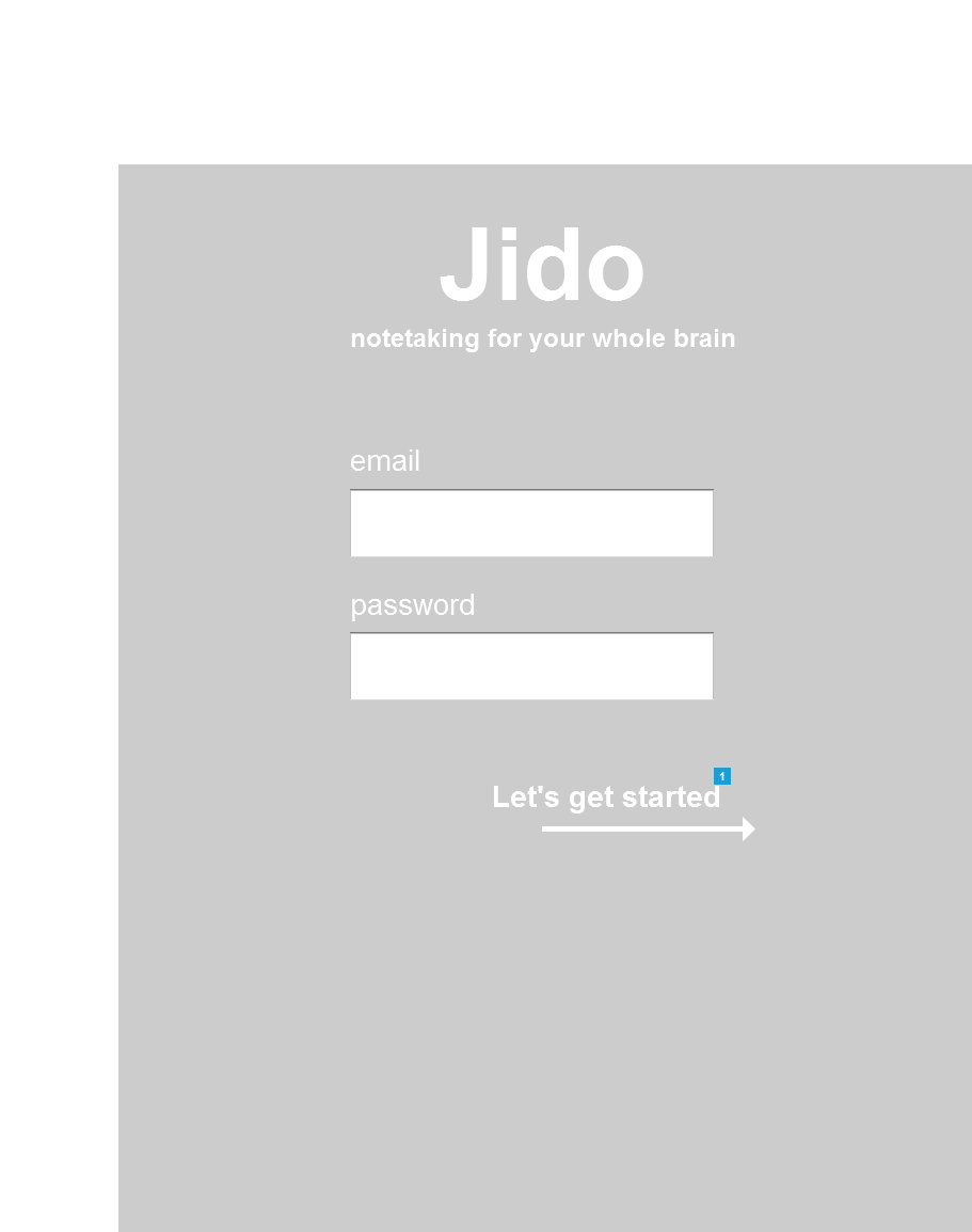
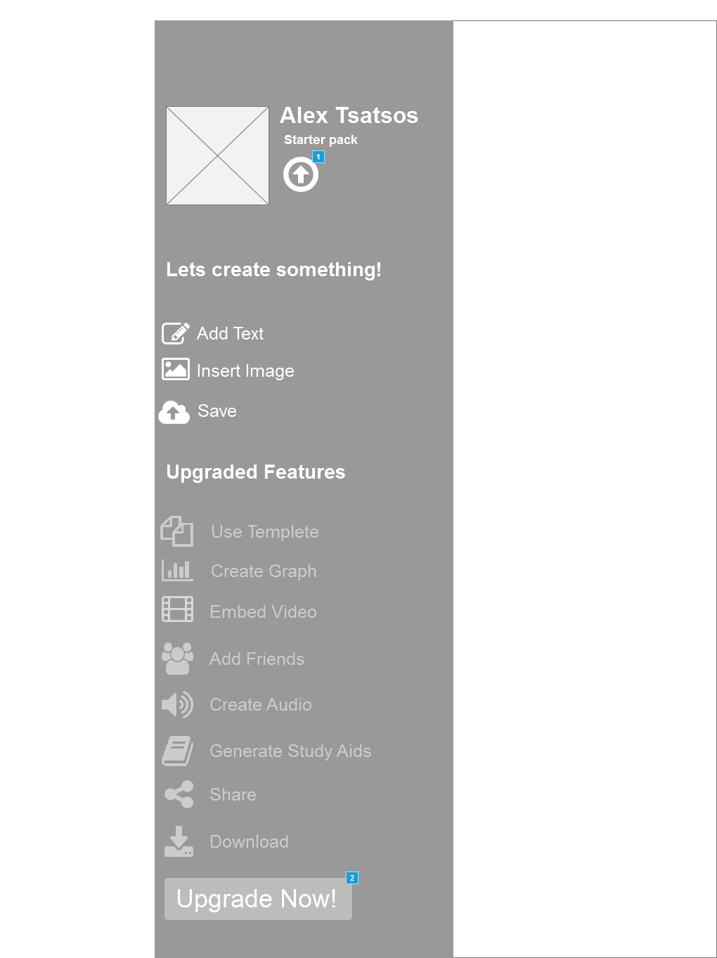
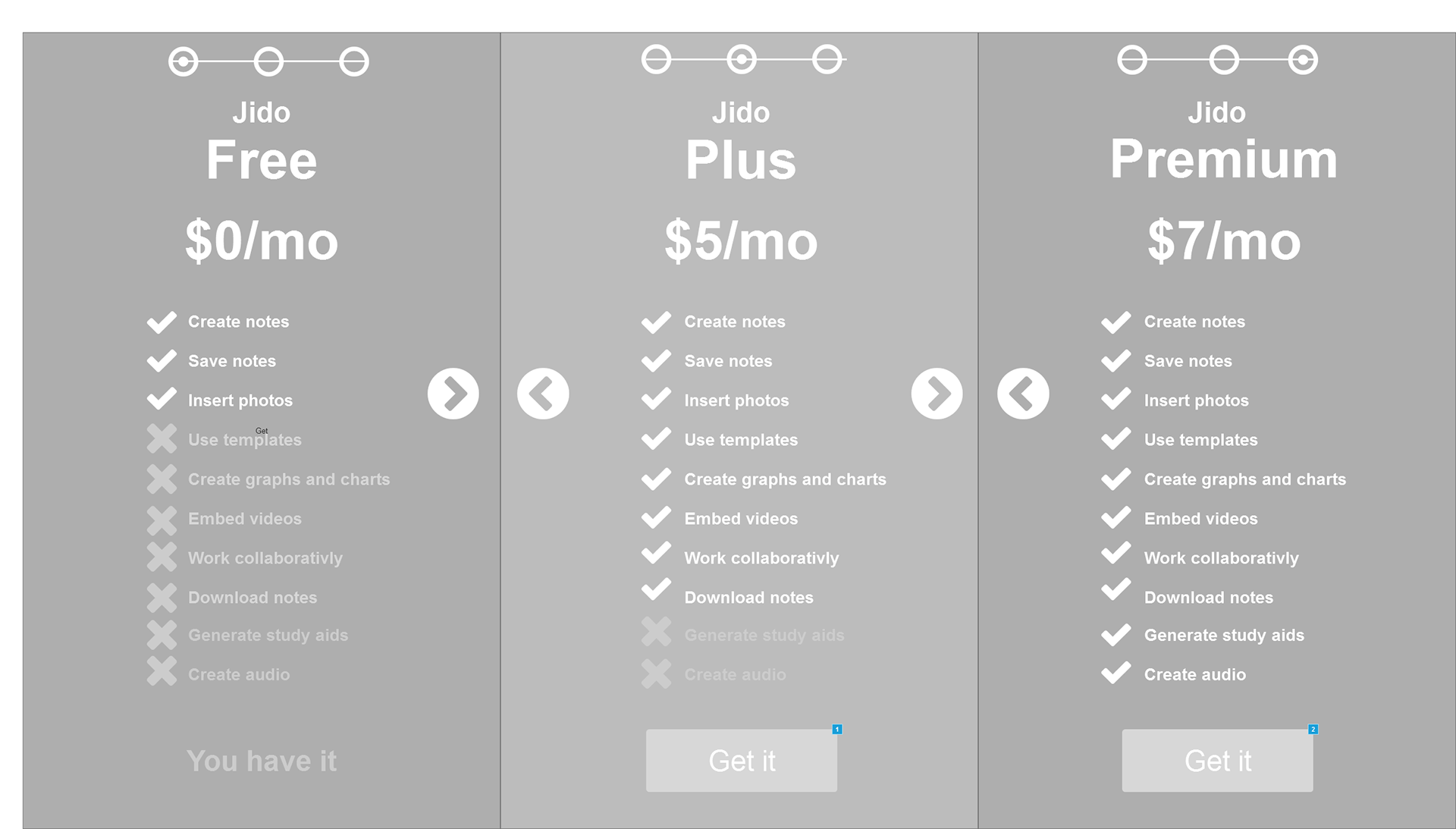
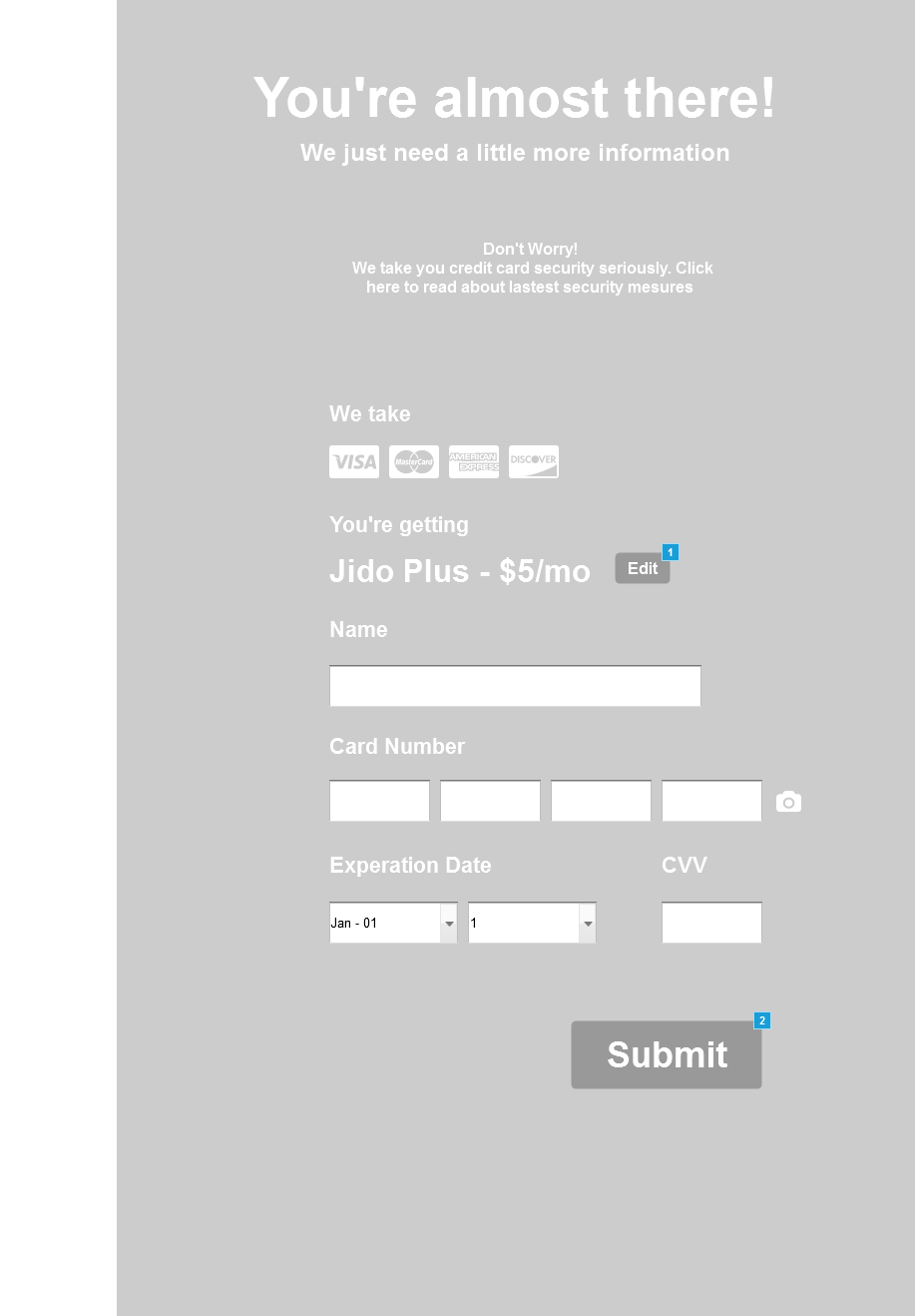
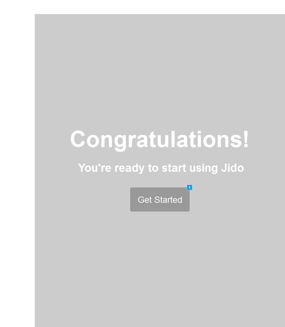
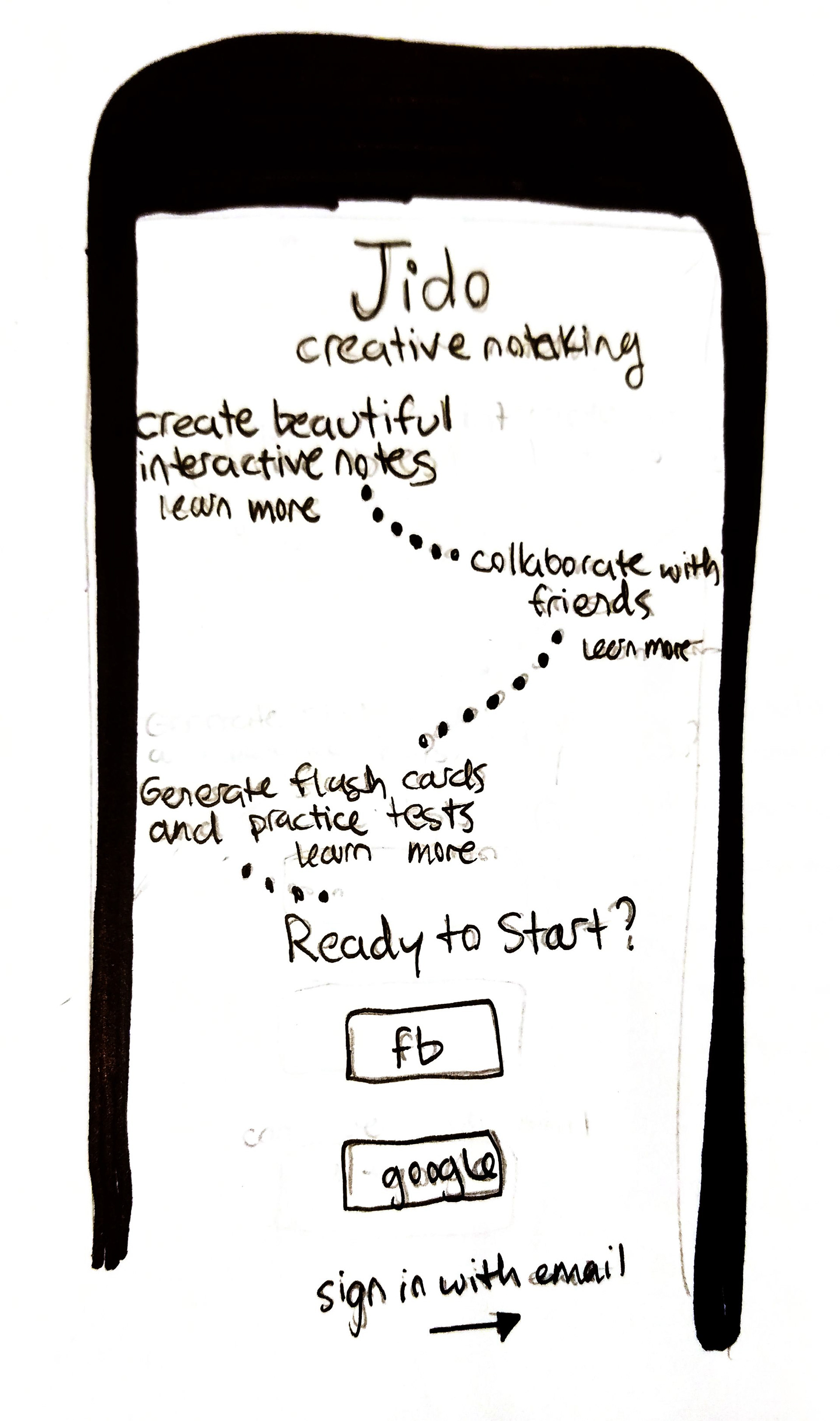
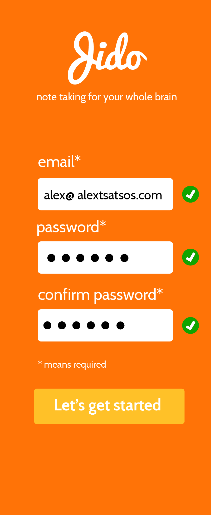
The Final Mobile Design
I created the mobile version first as recommended by mobile first design principles. Having to work with a smaller design space forced me to focus on what user interface elements where the most important and what was negotiable.
I also took elements unique to mobile into consideration. For instance, I made an effort to put all buttons near the bottom of the screen so users could easily hit them while holding their phone with one hand.


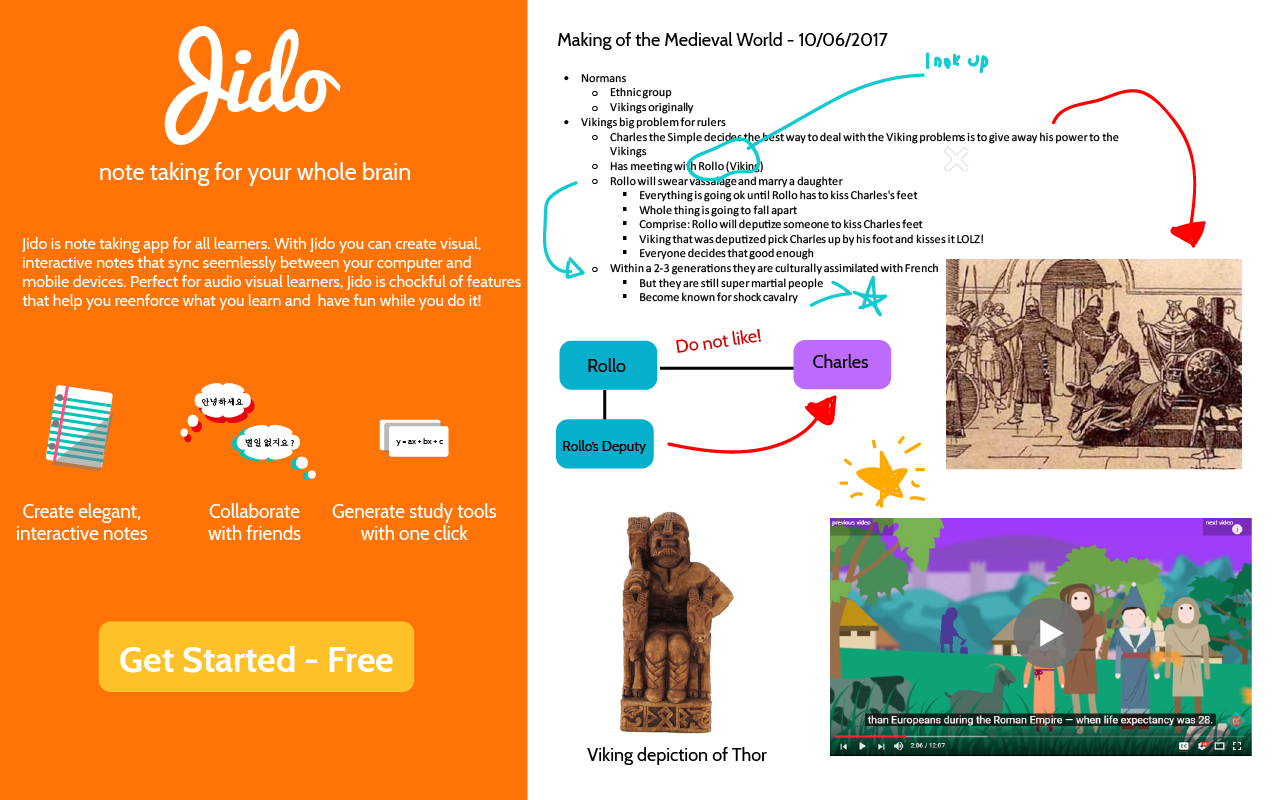
The Final Desktop Design
In addition to the app, I created a desktop version where users can also signup and purchase upgraded plans.
With the desktop version, I used the same fundamental user flow I created for the mobile version. In terms of layout, I was able to use a lot of the initial layout designs I created for the mobile version and expanded them for desktop use.


See my full designs and commentary here