This project is a sample mobile app that I created to ease the process of creating a shopping list for roommates. I solely did the user experience research, user experience design, user interface design and visual design. I used Jesse Garrett's concept of Surface, Skeleton, Structure, Scope, and Strategy to help guide my process
Defining the Problem
Living with roommates can create unique grocery shopping challenges. For people with busy schedules, there is often a lack of communication between roommates about basic things like food and grocery shopping. This can lead to multiple purchases of the same item or a shortage of common items.
Strategy
ShopSync seeks to improve the grocery shopping experience for roommates and families by allowing people to create shared grocery lists that sync instantaneously and keep everyone on the same page.
Scope
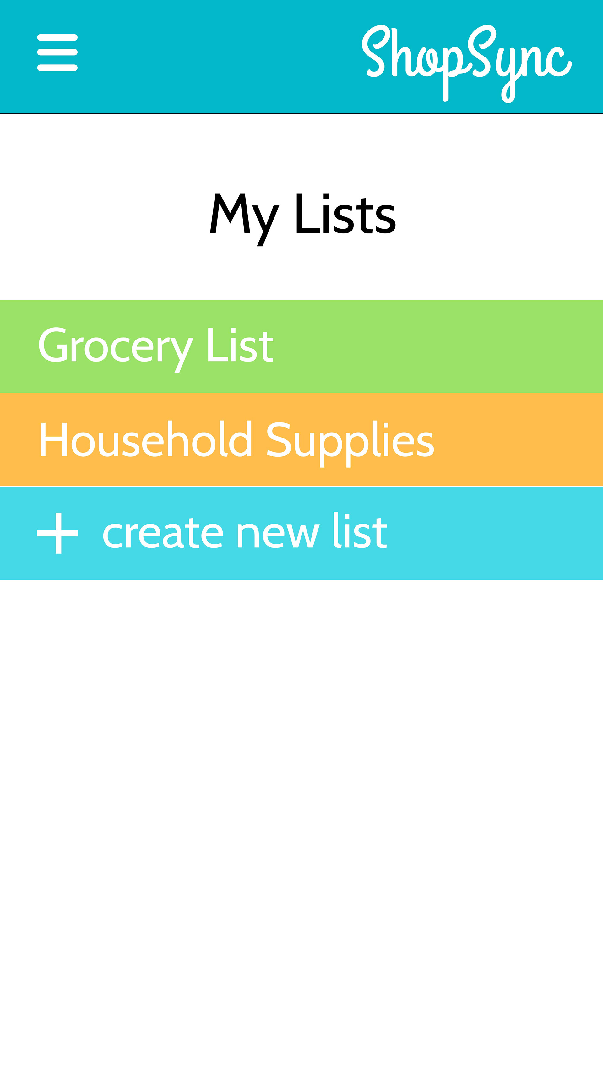
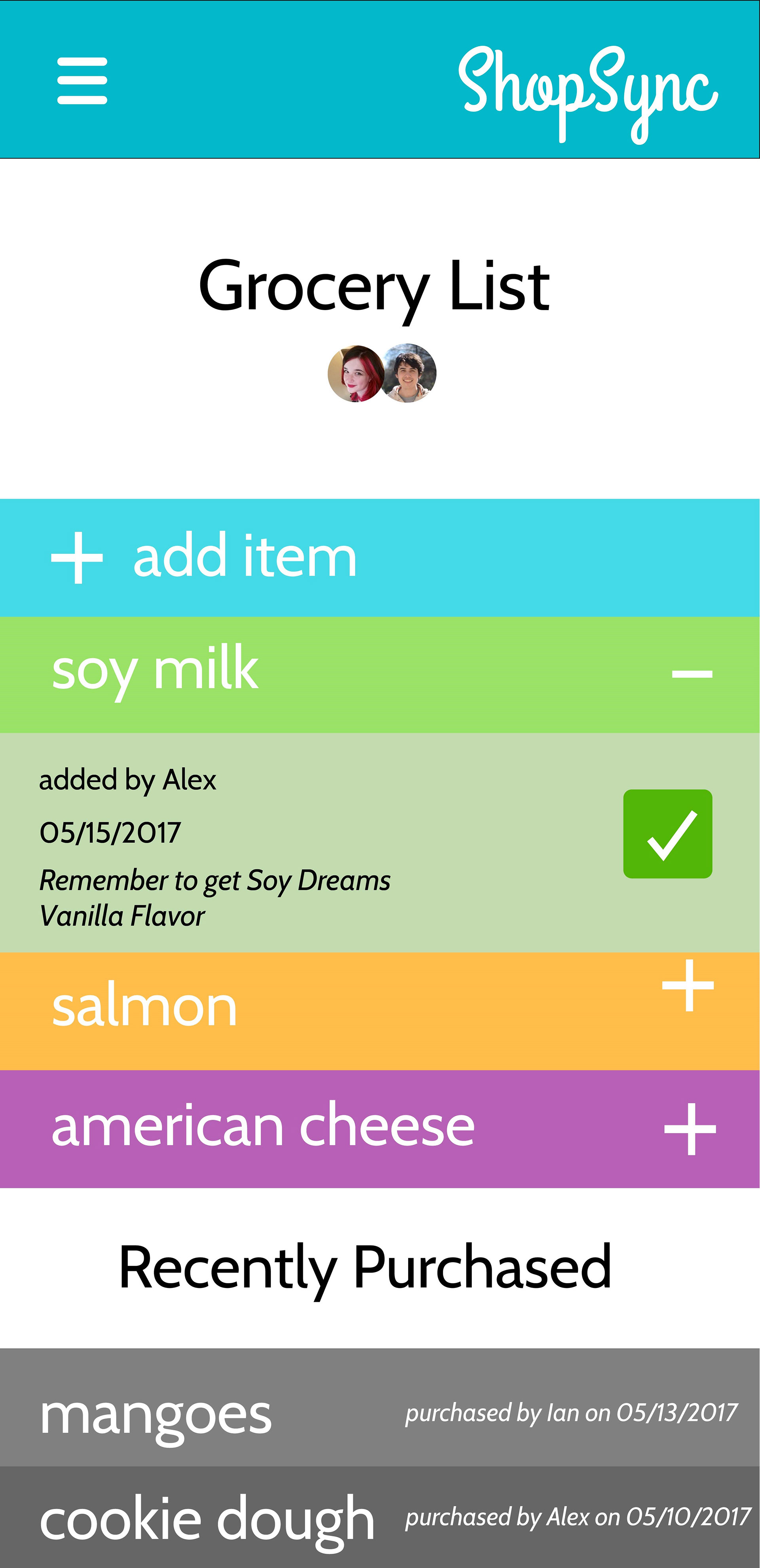
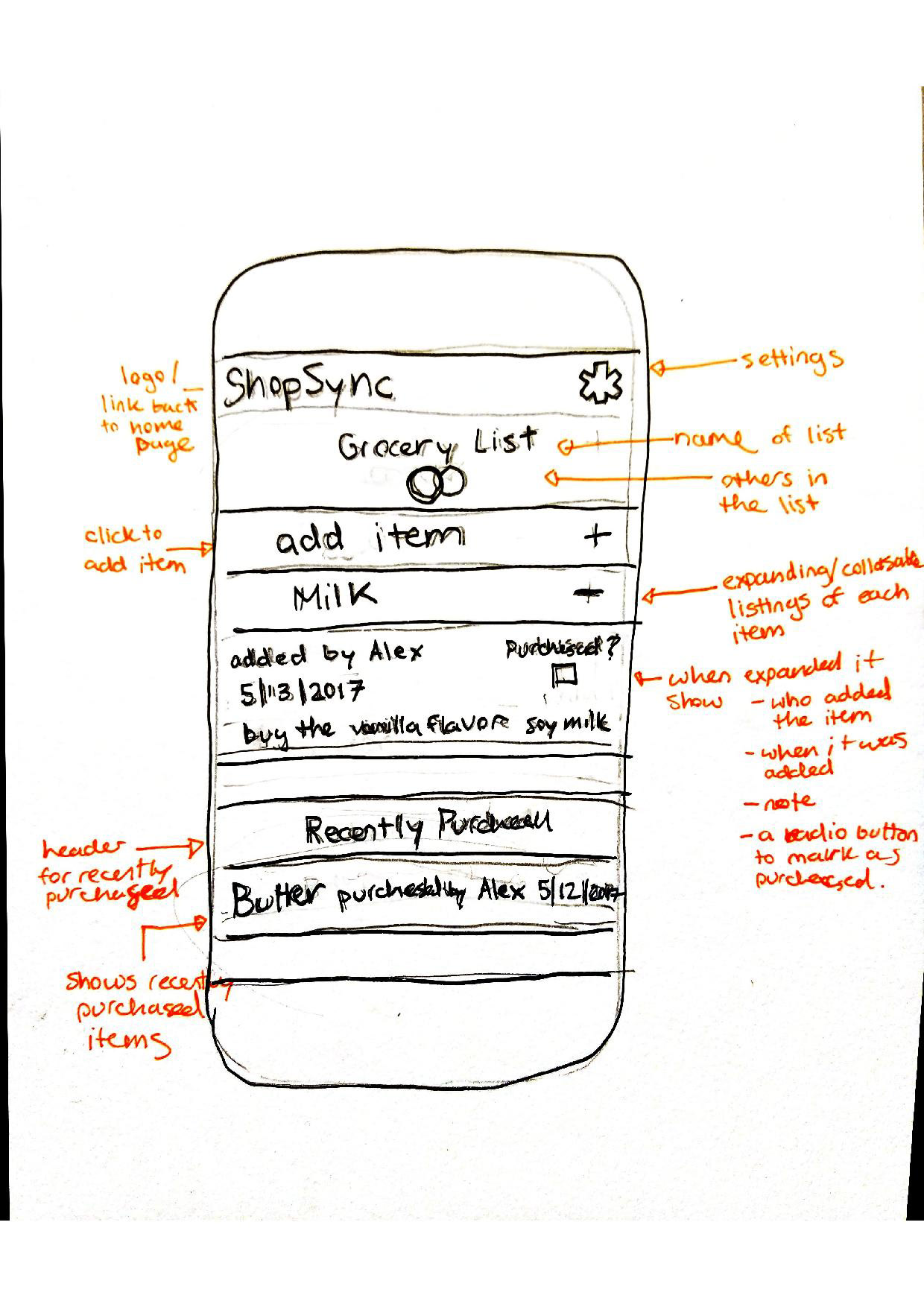
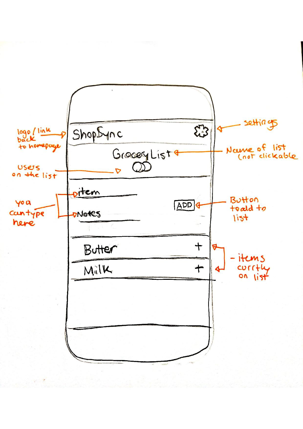
The scope of ShopSync will allow users to create multiple lists and invite other users with the app to join their list. When one user adds something to the list, it syncs up with all the other users on that list and they receive a notification. When an item is purchased, the user who purchased the item indicates this on the list. It then goes into the category of purchased items with the date it was bought, and all other users receive a notification.
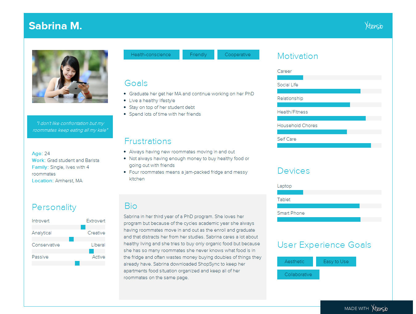
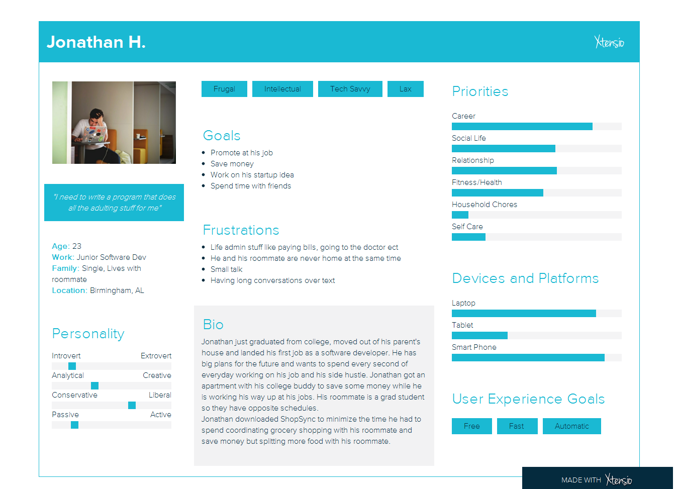
To help define scope and strategy I created user persona based on my research to help keep the user's needs in mind.
The Structure
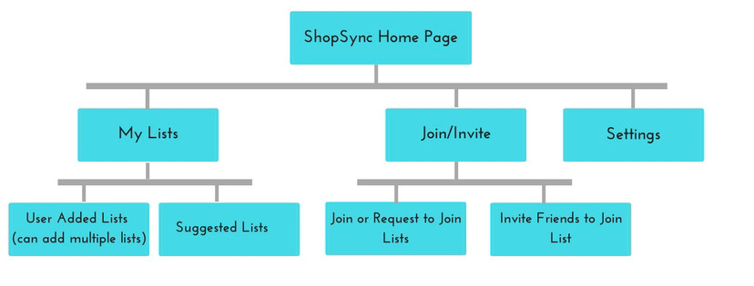
With the scope in place, I next needed to define how the user would move through my app. This stage also involved a lot of research and feedback. I mindfully looked through other apps, thought about how the navigation flowed, and determined how I intuitively knew to go certain places. I also made three drafts of my flow chart from my previous slide and asked people which flowed the most intuitively for them.
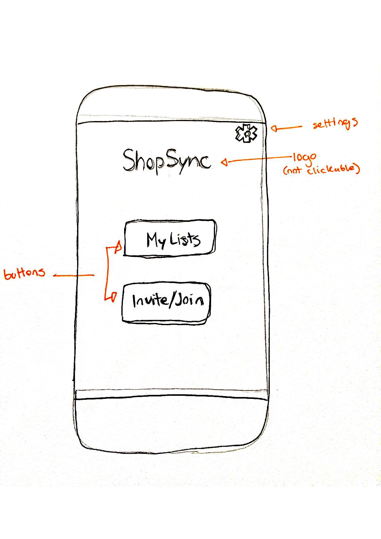
The Skeleton
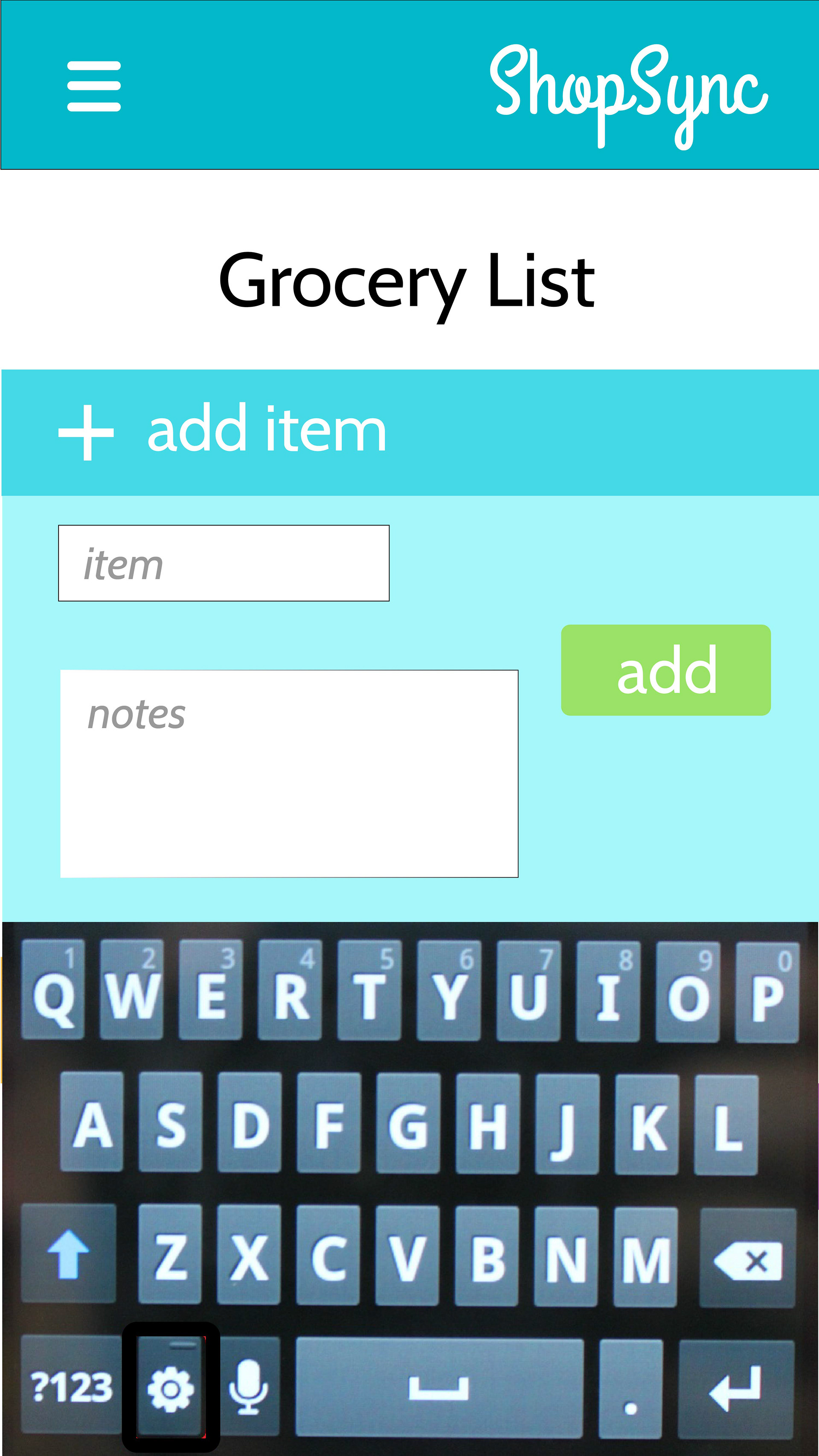
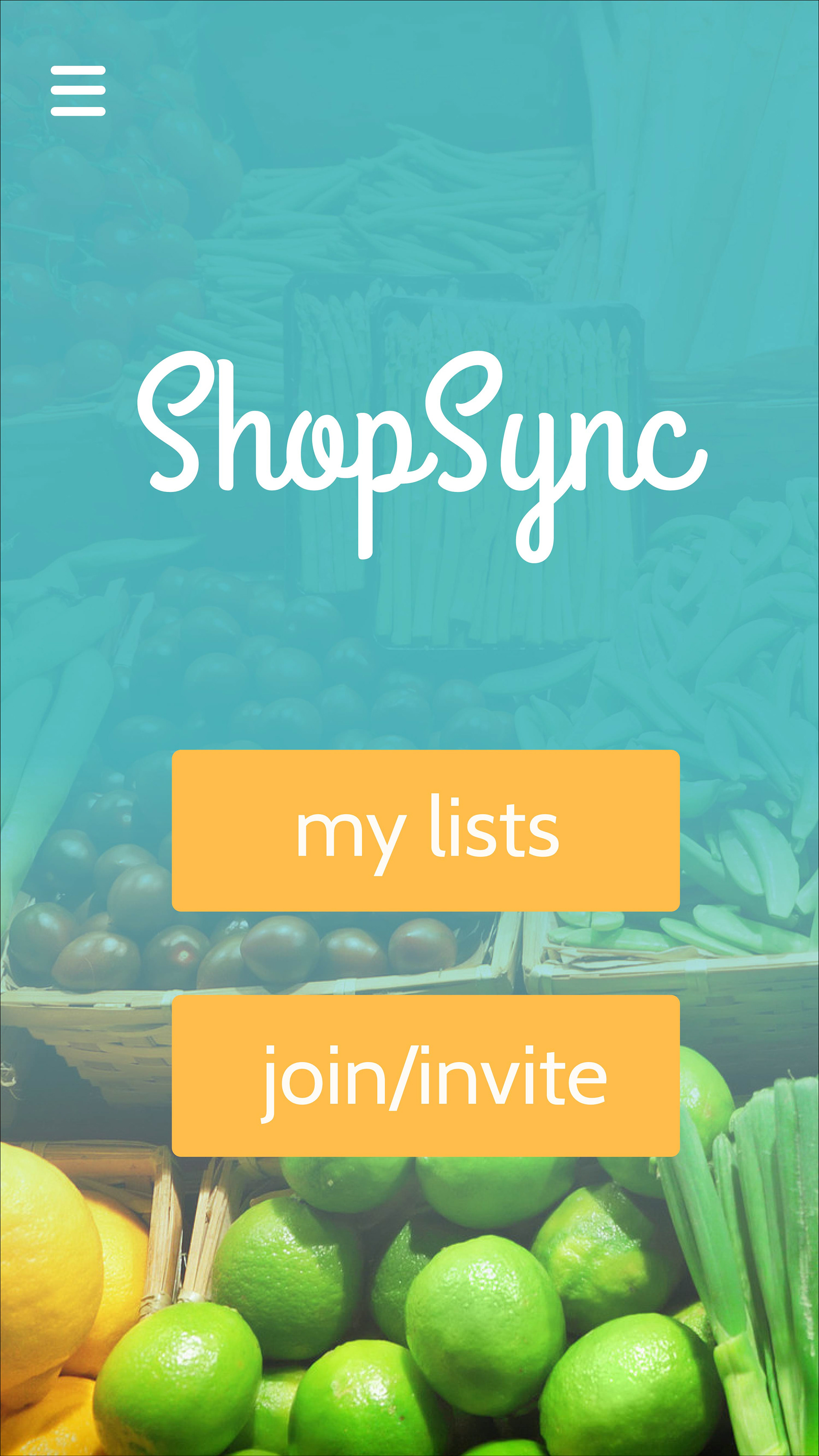
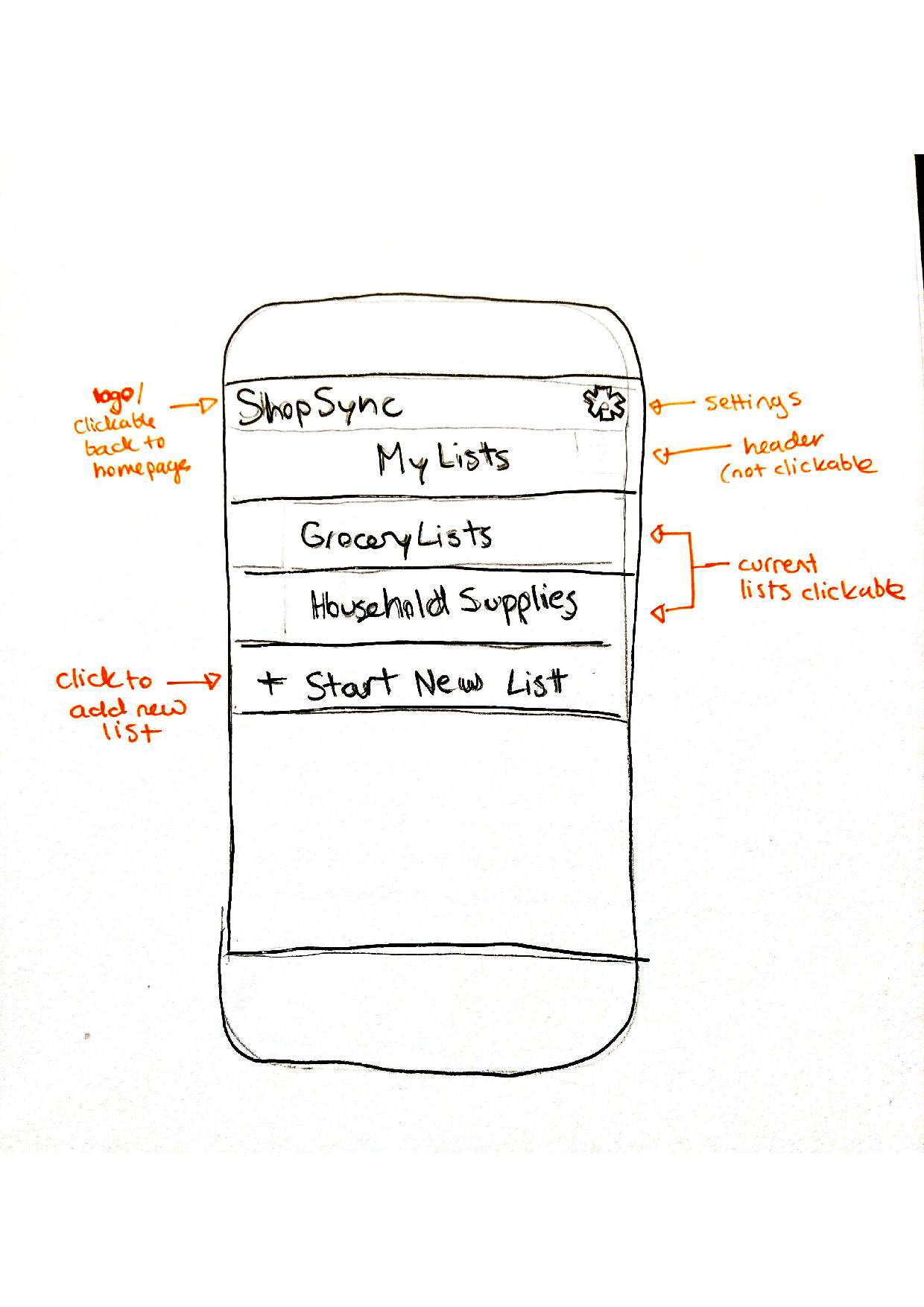
For the skeleton, I picked only a few of the key pages to illustrate. I chose the home page which would lead to the “My Lists” page which would lead to the “Grocery List” page. Then I mapped out two aspects of the “Grocery List” page. The first page shows where the user can click an item that’s already been added, and the second shows where the user is adding an item. For this phase, I also relied on research, previous experience, and peer feedback. I started by drawing what I wanted the page to look like then I started annotating which forced me to think more critically about why things were placed the way they were. Based on that, I was able to make the final drafts.
The Surface
Though the surface aspect was by far the most enjoyable aspect for me to work on, it would have been impossible without all of the thought that went into the previous stages. I used Adobe Illustrator to create the final prototypes.The biggest thing I hadn’t anticipated is how much the color would affect the visual hierarchy so I spent a long time coming up with cohesive color pallets to complete the design and to further help the user navigate the interface.